Mid-summer is often when New Zealand boaties take a proper look at what months of sunlight, salt air, damp gear, and wet swimmers have done to their interiors. As the season begins to ease, the appeal of new squabs, fresh upholstery, or a more thorough rethink grows hard to ignore.
Heading into 2026, overtly nautical styling has had its day. Dark navy everywhere, bold stripes, rope details, shell motifs, and themed cushions now read as tired rather than charming. Boat interiors are tracking the same direction as high-end residential design, moving toward something calmer, more restrained, and quietly confident.
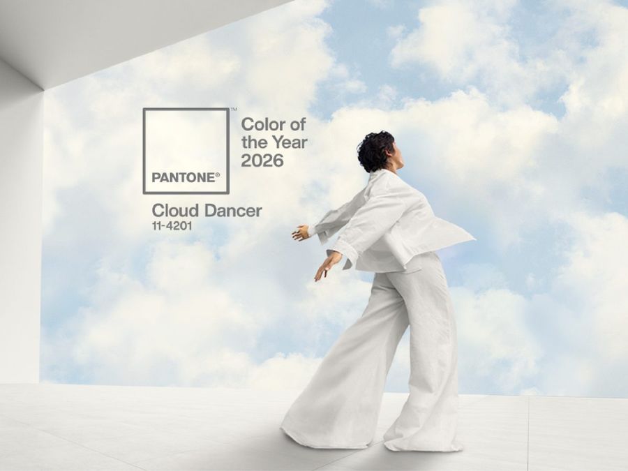
The most telling signal comes from the Pantone Color Institute, which has named Cloud Dancer as its Colour of the Year for 2026. It is a soft, balanced off-white that sits at a considered midpoint between warmth and coolness, and on board a boat, that balance is precisely what makes it useful.
White, of course, is no stranger to boat interiors. Its presence there has generally been driven by practicality as much as aesthetics. From the mid-twentieth century onward, interior styling borrowed freely from automotive design, pairing white with seafoam green or red in straightforward two-tone arrangements. Traditional yachts settled into a familiar formula of white ceilings and bulkheads set against varnished timber joinery. Through the 1980s and 1990s, interiors grew lighter and more open, with white-on-white finishes used to make cabins feel larger and airier.
More recently, pure white softened into taupes and layered neutrals, with varied fabric textures used to create visual depth without any sense of busyness. For 2026, white, or more precisely off-white, returns as a deliberate centrepiece rather than a background default, handled with considerably more intention than before.
The practical case for white in a marine environment remains strong. It reflects heat, amplifies natural light, and gives compact cabins a sense of space they might not otherwise have. It also holds up reasonably well under UV exposure and makes wear or emerging problems straightforward to spot. The honest trade-off is upkeep. White shows grime quickly, and high-gloss finishes can produce uncomfortable glare below decks. Off-whites, satin finishes, and fabrics with some texture tend to navigate those challenges far better.
Nature-inspired tones fill the supporting role. Sage green, eucalyptus, sand, clay, and muted teal appear across cushions, cabin panels, and upholstery details. Deep blues have not disappeared entirely, but they function mostly as considered accents rather than the dominant colour story they once were.
Metal finishes are following a similar path toward softness. Chrome is giving way to brushed bronze, champagne, and warm metallics throughout. Lighting choices reflect the same shift, with warmer tones and indirect fittings favoured over the bright, showroom-style illumination that once felt standard.
Underlying all of it is a sharp focus on longevity. The most successful interiors for 2026 are designed to age gracefully rather than simply photograph well. Marine-grade fabrics are essential, since domestic textiles rarely survive the particular combination of UV, moisture, and salt that life on the water delivers. Ease of cleaning and colours that wear with some dignity are equally important considerations.
For Kiwi boaties thinking about a refresh, the direction is straightforward enough. Keep the palette light. Keep the mood calm. Choose materials built for the conditions rather than borrowed from the living room. An interior put together with those principles in mind should feel just as right several seasons from now as it does on the day it is finished.